ADVANCED DATA VISUALISATION USING AUSTRALIAN OPEN TENNIS DATASET
Dataset Summary
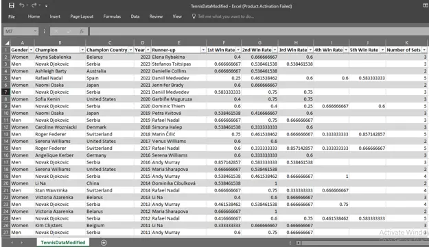
The dataset used in this analysis comprises of all the winners of Australian open Tennis Championship from the year 1905 to the year 2024. It is in an Excel format where each row refers to a tournament and includes data such as year, player’s name, gender, country of origin, score and details of the runner up (Australian Open Tennis Championships, 2024). The data differs between men’s and women’s championships, and in order to compare the examination of data, there are detachable sheets for men and women’s categories. That way it is possible to analyse basic categories of performance indicators, set and game winning ratios, scores and time taken.
The history is presented in the particular years – the beginning of women’s championships in 1922 and, of course, dual champions in 1977. It also captures switches in terms of intensification and weakening of competition and shifts in the power balance between the players. In creating this article, Tableau has been employed in the creation of such visualisation that would capture this huge temporal nature and give insights into areas of long-term trends, differences in performances, and geographical distribution of these champions. These are; Parcoord plots, treemaps, geographical maps, and win rate per performance chart, all of which present a different perspective of the data with a view of individual performances of specific players of the game right from the overall perspectives of the entire championship game. The structure of the collected dataset provides a good basis for developing visually rich stories as well as statistically detailed visualisations. Students seeking best assignment help can use this sample to understand how data can be analysed and presented through Tableau.
Visual Analytics Creation
Treemap
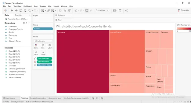
Distribution of wins by gender and country can be seen in the data that is represented on the map in the form of a treemap (Batt et al. 2020). Each round of block is representing any single player where the size of the block is proportional to the number of championships a player has won and the colour in which block is again referring of GW or SWR. Such a double coding is a path to the identification of talented employees at the moment when they begin performing effectively. For instance, Novak Djokovic is highlighted by 10 champions and a high winning streak that will be followed by Serena Williams and Margaret Court. The treemap also gives a clear structure of the goals and proves the company’s success not only in the quantity aspect, but the quality of performance difference male and female employees.

Parallel Coordinates
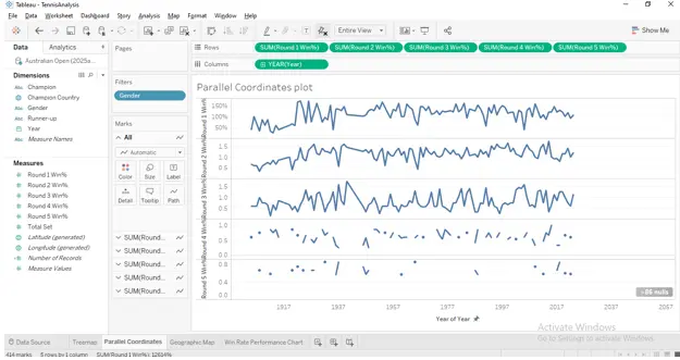
As for the multivariate analysis, the parallel coordinates chart can be used to analyse data regarding match duration, seed, and set win ratios (Vasundhara, 2021). It also can be noted that every line refers to a certain champion; here, girls and boys are marked with different colors, and champions who performed before or after the specified time limit are highlighted with a gray color. Some observations included in the chart include, how seeds below the second seed registered slightly longer matches duration while having almost equal win percentages especially in earlier years. It also reveals some interesting features such as some of the seeds are having slow performance or some matches took long time having small ratio of win. This kind of visualization is most helpful in considering the changes in performance over years and to understand the fine details of the changes in male and female styles of play.
Students looking for help with Computer Science assignment topics can use this section to understand how parallel coordinates support multivariate analysis and reveal patterns across different variables.
Geographic Map
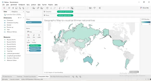
The geographic map given in the figure also shows the distribution of championship lost by nationality. In general, it uses barbour that measures the proportion of wins by country / gender and the use of color gradients to show the number of wins. Out of the tennis champions, Australia, the United States as well as Switzerland represent significantly while the South and the Southeast Asia represent strikingly low percentage. Some GDI countries were omitted including Yugoslavia and Czechoslovakia due to the shortcomings of the software in capturing the changes in geopolitical settings. Another interesting observation from the map is enhanced through a direct analysis of the numbers as over the years, there is a diversification of champions originating from different parts of the world after 1970. This change can be explained by various socio-political factors and the growing possibility of obtaining high-level sports education/training and taking an active part in sport throughout the world.
Win Rate Performance Chart
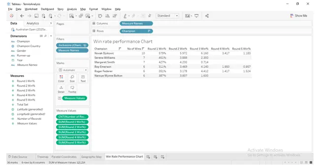
(Source: Made by self in Tableau Desktop)
This chart is specifically to players with 5+ championships, to look at their averages of sets and games won throughout their professional careers. Line graphs include a dissect by gender and time line that shows that although Djokovic has the most championships number, there are powerful players such as Daphne Akhurst with better efficiency in the game. Trendline overlays can be used to represent one’s performance constancy and performance bands are color coded for distinction as well. The lack of correlation between the number of titles and the winning percentage shows that the result, which includes numbers of points scored, is only one factor determining the overall success while the consistently of the results, strategy for a certain tournament match, and the draw strength are the other factors to consider (Islam and Jin, 2019).
Executive Summary and Conclusion
The analysis of data regarding the Australian Open over the last 100 years provides valuable information about the history of championships, the performance of the players, and gender-related aspects. Tableau provide features for setting high charting tools that allowed the use of extension such as treemaps, parallel coordinates, geographic maps and performance charts. Other than for storytelling, these tools were used to unveil other statistical patterns including scores of gender, shifts in geographical dominance, and dynamism of performance.
As seen in each distinct visualization, labelling was always emphasised as well as interactivity and the ability to compare. For instance, by comparing the two figures, the parallel coordinate plot gives an excellent portrayal of how women’s matches, which are generally shorter than those of men, have the same level of win efficiency. Treemaps themselves presented a storyline about the old guard of tennis players such as Djokovic and Williams where as geographical maps offered a proper perspective about the transition of tennis from regional sport to international one. The executive summary reinforces these views by demonstrating how visual tools aid in understanding and persuading when it comes to the information presented.
Tableau became an absolute essential for the integrated analysis of information and their representation in the form of a coherent picture. It also unveiled its capacity in dealing with hierarchal and multiple variable data which indeed complemented the overall analysis. All in all, the project provides a broad and diverse account of tennis performance by connecting matters that are personal, national, and global, thereby presenting gender-sensitive insights into high achievers’ legacy.
Reference List
Journals
- Batt, S., Grealis, T., Harmon, O. and Tomolonis, P., 2020. Learning Tableau: A data visualization tool. the Journal of economic education, 51(3-4), pp.317-328.
- Islam, M. and Jin, S., 2019, November. An overview of data visualization. In 2019 International Conference on Information Science and Communications Technologies (ICISCT) (pp. 1-7). IEEE.
- Khedikar, K.A., 2021, April. Data analytics for business using Tableau. In Proceedings of the International Conference on Innovative Computing & Communication (ICICC).
- Vasundhara, S., 2021. Data visualization view with Tableau. Stoch Model Appl, 25, pp.178-87.